Shopify site speed and navigation are the invisible conversion killers. While you obsess over button colors and product descriptions, slow load times and confusing menus are quietly driving away 30-40% of your potential customers before they even see your products.
The data is brutal: Google research shows 53% of mobile visitors abandon sites that take longer than three seconds to load. Meanwhile, 43% of visitors go straight to the search bar, and 68% never return if they can't find what they need. For Shopify stores, these technical fundamentals aren't about perfection—they're about survival.
Here's the opportunity: most stores neglect technical optimization because it's not sexy. While your competitors focus on Instagram aesthetics, you can capture the customers they're losing to slow pages and bad navigation. A one-second improvement in load time increases conversions by 7%. Better filtering and search convert browsers at 2-3x the rate of those who browse without tools.
This guide covers the technical foundations that multiply the effectiveness of every other optimization you do. Fast pages mean visitors see your product images. Good navigation means they find the right products. Together, they create the baseline experience that makes conversion possible.
Let's build that foundation.
Why technical foundations matter for conversions
Before diving into tactics, understand why site speed and navigation deserve priority over flashier optimizations.
Speed is a conversion multiplier. Every marketing dollar you spend drives traffic to your store. If half those visitors bounce due to slow load times, you're wasting 50% of your ad spend. An ecommerce site that loads in 1 second has a conversion rate 2.5x higher than a site that loads in 5 seconds. Speed doesn't just improve conversion—it makes every other optimization more effective.
Navigation determines which products visitors see. You could have the perfect product for a customer, but if they can't find it through your menu or search, it doesn't exist to them. Good navigation isn't about aesthetics—it's about product discovery, which directly drives revenue.
Technical issues disproportionately hurt mobile conversions. Mobile accounts for 70%+ of Shopify traffic but converts at roughly half the desktop rate. Much of this gap comes from technical problems: slow loading on cellular connections, hard-to-tap buttons, and navigation designed for desktop mice rather than mobile thumbs. Fix technical foundations and you close the mobile conversion gap.
These optimizations compound. A fast-loading product page with clear navigation and smart search doesn't just improve metrics incrementally—it creates a qualitatively different shopping experience. Customers move from browsing to purchasing faster, with less friction and frustration.
Think of technical optimization as clearing debris from a river. Your marketing drives water (traffic) downstream. Product pages, pricing, and checkout are the destination. But if the river is clogged with rocks (slow pages, bad navigation), most water never reaches the destination. Clear the river first, then optimize the destination.
Optimize your Shopify site speed
Website performance is the foundation of conversion rate optimization. For Shopify merchants, this isn't just about user experience—it's directly tied to revenue. A store generating $10,000 per day could lose $255,500 annually from just a one-second delay.
The good news? Shopify provides a solid foundation for performance, but you need to optimize it properly. Let's walk through the specific tactics that will make your store faster.
Start with images: Your biggest performance win
Images are typically the heaviest elements on your Shopify store, often accounting for 50-70% of total page weight. This makes image optimization your highest-impact starting point for improving site speed.
Before uploading any image to Shopify, compress it. While Shopify automatically compresses images upon upload, pre-compressed images still perform significantly better. Free tools like TinyPNG or Squoosh allow you to compress images manually while maintaining visual quality. For automated optimization, Shopify apps like TinyIMG can compress your entire existing image library and automatically optimize new uploads as they're added.
Pay attention to image dimensions. Upload product images at the exact size your theme requires rather than uploading massive files and letting Shopify resize them. Most modern Shopify themes perform best with product images around 2048x2048 pixels maximum. Check your theme's documentation for specific recommendations. As a general rule, aim to keep each product image under 200KB.
Format matters too. Use JPG for photographs and product images—it provides excellent compression for photos. Only use PNG when you need transparency, such as for logos or graphics with see-through backgrounds. Avoid uploading massive PNG files for regular product photos, as they're significantly larger than equivalent JPGs.
Enable lazy loading for images below the fold. This means images only load as visitors scroll down the page, dramatically reducing initial page load time. Most modern Shopify themes have this built in, but verify it's enabled in your theme settings.
Choose your theme wisely
Your Shopify theme choice has enormous impact on site speed. Themes vary wildly in code quality, and a poorly coded theme can cripple your conversion rate no matter how well you optimize everything else.
Before purchasing any theme—even a free one—test its performance. Visit the theme's demo store and run it through Google PageSpeed Insights. You want to see mobile scores above 50 at minimum, ideally above 70. Don't just test on your desktop computer; check the demo on actual mobile devices since mobile performance often differs dramatically from desktop.
Look for themes with clean, minimal code. Avoid themes packed with dozens of built-in features you won't use—every unused feature still adds code that slows your store. Be especially wary of themes that rely heavily on homepage sliders with multiple high-resolution images, excessive animations, or parallax scrolling effects. These visual flourishes look impressive in demos but often come at a significant performance cost.
Shopify's default free theme, Dawn, is specifically optimized for performance and serves as an excellent baseline. It's built on Shopify's latest Online Store 2.0 architecture, which provides better performance than older theme frameworks. Among premium themes, Turbo is designed specifically for maximum speed, while Streamline offers excellent performance with more design flexibility.
Tame your app bloat
Here's an uncomfortable truth: apps are probably slowing down your store more than anything else. Every Shopify app adds JavaScript, CSS, and API calls that impact page loading. Shopify apps significantly impact performance. Popular review apps alone can add 600-800KB of JavaScript, pop-up builders add 400-600KB, and chat widgets add 400-500KB. Each app adds code that must be loaded, parsed, and executed—creating a cumulative slowdown that can cost you customers.
Conduct a monthly app audit. List all installed apps and honestly ask whether you've actively used each one in the past 30 days. Apps you installed for a single campaign six months ago might still be loading code on every page of your store. Check Shopify's Online Store Speed report (more on this below) to see each app's specific performance impact.
When you decide to remove an app, uninstall it completely—don't just disable it. Disabled apps often continue to load code. Even worse, many apps leave behind orphaned code snippets in your theme files after uninstallation. Check your theme's layout/theme.liquid file and other template files for leftover app code and remove it, or hire a Shopify Expert to do a code cleanup.
Common performance culprits include multiple review apps running simultaneously, social media feed widgets that load external content, excessive analytics and tracking tools (you probably don't need five different analytics apps), and pop-up builders that load heavy JavaScript libraries. If you need these functions, look for lightweight alternatives or consolidate multiple tools into single, well-optimized apps.
Master Core Web Vitals
Google uses Core Web Vitals as ranking signals, and these metrics directly correlate with user experience and conversion rates. Understanding these three metrics helps you identify and fix the right performance issues.
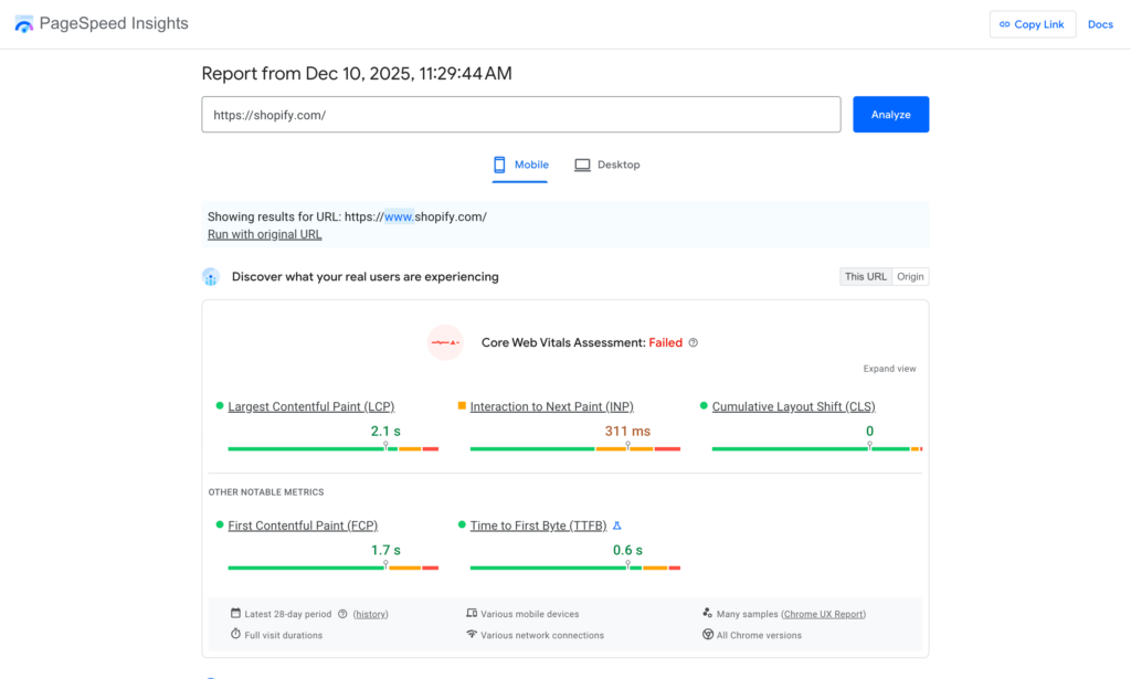
Largest Contentful Paint (LCP) measures how quickly the largest element above the fold loads—typically your hero image or main product image. Google recommends under 2.5 seconds. To improve LCP, optimize and compress your hero images aggressively, ensure you're not lazy loading above-the-fold images, and consider using Shopify's preload feature for critical images.
Interaction to Next Paint (INP) measures how quickly your site responds to user interactions like clicks and taps. Google recommends under 200 milliseconds. Slow INP usually indicates too much JavaScript executing when the page loads. Minimize JavaScript, defer non-critical scripts, and audit apps that add heavy JavaScript libraries.
Cumulative Layout Shift (CLS) measures visual stability—whether elements jump around while the page loads. Google recommends under 0.1. Common causes include images without width and height attributes, fonts that load late, and apps that inject content dynamically. Always specify image dimensions in your theme code, use proper font loading techniques, and be cautious with apps that add content after page load.
Run your store through Google PageSpeed Insights monthly to check these metrics. The tool provides specific, actionable recommendations for improvement. Focus on mobile scores since that's where most of your traffic comes from.
Shopify provides built-in performance reports that are often underutilized by merchants.
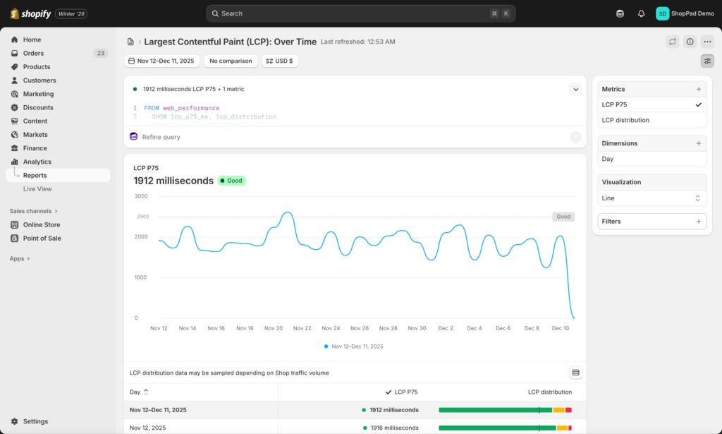
Make it a weekly habit—every Monday morning, spend five minutes checking your speed score. Note any significant drops and investigate what changed. Track your scores in a spreadsheet to identify trends over time. Performance typically degrades gradually as you add products, apps, and customizations, so regular monitoring helps you catch issues before they become serious problems.
Additional testing and monitoring tools
Beyond Shopify's built-in reports, several free tools provide deeper performance insights. GTmetrix offers detailed waterfall charts showing exactly what loads when, helping you identify bottlenecks. WebPageTest lets you test from multiple geographic locations and connection speeds, revealing how your store performs for international customers or users on slower connections.
Chrome's built-in DevTools (press F12) provides real-time performance profiling. The Lighthouse tab runs the same audits as PageSpeed Insights directly in your browser, while the Performance tab lets you record and analyze exactly what happens as your page loads. The Shopify Theme Inspector Chrome extension helps identify Shopify-specific performance issues in your theme code.
Mobile performance & optimization
Mobile accounts for over 70% of Shopify traffic but converts at roughly half the rate of desktop. While many factors contribute to this gap, mobile technical performance is the foundation that enables everything else.

Test your own store's mobile vs. desktop conversion rates in Shopify Analytics → Reports → Sessions by device type. If mobile converts at less than 70% of your desktop rate, mobile optimization should be your top priority.
The problem isn't that mobile shoppers are less serious—it's that mobile experiences are often objectively worse. Pages designed for desktop computers with high-speed WiFi fail on smartphones with cellular connections. Navigation built for mouse cursors frustrates users with thumbs.
Optimize for real mobile conditions
Test on actual devices, not browser simulators. Desktop browser resize tools don't accurately represent mobile performance. Use real iPhones and Android devices to experience what your customers experience.
Test with cellular connections, not WiFi. Your office WiFi might load pages instantly, but your customers on 4G or 5G see different performance. Disable WiFi on your phone and browse your store—you'll discover issues that desktop testing misses.
Prioritize mobile page speed aggressively. Run your store through Google PageSpeed Insights and focus exclusively on the mobile score. Desktop scores above 80 are common; mobile scores above 60 are good. Below 40 means you're losing significant mobile conversions to slow loading.
Mobile-specific image optimization
Many themes serve the same large desktop images to mobile devices, wasting bandwidth and crushing load times. Modern Shopify themes should use responsive images that serve appropriately sized versions based on screen size.
If you see a 2400px-wide image on a 375px phone screen, your theme isn't optimizing properly.
Mobile image checklist:
- Product images should be 800px wide maximum for mobile
- Hero images should be 1200px wide maximum for mobile
- Compress mobile images more aggressively than desktop (100KB target vs. 200KB)
- Prioritize loading the first product image instantly—defer the rest
Simplify mobile layouts
What looks clean on a 27-inch desktop monitor overwhelms a 6-inch mobile screen. Reduce the number of homepage sections for mobile users, simplify product page layouts, and eliminate unnecessary elements.
Mobile navigation requirements:
- Hamburger menu should expand smoothly without lag
- Search should be prominent (sticky search icon in header)
- Category links should be thumb-friendly (minimum 44px tap targets)
- Filter buttons should be large and positioned at the top of collection pages
Mobile checkout optimization:
- Enable Shop Pay (one-click mobile checkout)
- Ensure all form fields are mobile-optimized with appropriate keyboard types
- Make "Add to Cart" and "Complete Order" buttons full-width
- Test the entire checkout flow on multiple devices and screen sizes
Reduce mobile JavaScript
JavaScript executes more slowly on mobile devices due to less processing power. Apps that load smoothly on desktop can cripple mobile performance.
Scrutinize any app adding more than 100ms to mobile load time. Consider whether that app's benefits justify the mobile performance cost.
Mobile optimization isn't a separate project—it's the lens through which every technical decision should be evaluated. With 70% of your traffic on mobile, mobile performance is your performance.
Design intuitive navigation
Think about the last time you walked into a poorly organized store. Products scattered randomly, no clear sections, no helpful staff. You probably left frustrated and empty-handed. Your Shopify store's navigation works the same way—if customers can't find what they're looking for within seconds, they're gone.
43% of visitors go immediately to the search bar, and if they can't find what they need, 68% will never return to that site.
The math is simple: better navigation and search equals more conversions. Let's fix yours.
Design an intuitive menu structure
Your main navigation menu is the roadmap to your entire store. Get it wrong and customers wander aimlessly. Get it right and they find what they need in seconds.

The fundamental rules:
Keep it shallow. Nielsen Norman Group research shows that "the deeper a hierarchy becomes, the more likely visitors are to become disoriented." Instead of forcing customers through Home → Men's → Shirts → Casual → Short Sleeve, use Home → Men's Shirts with filters for style and sleeve length.
Limit top-level categories to 5-7. This follows Miller's Law—the average person can hold 7 (±2) items in working memory. Too many top-level options create decision paralysis. If you have more categories than this, consider consolidating or using mega menus.
Use clear, descriptive labels. "Shop" is vague. "Women's Clothing" is clear. Don't get cute with category names—customers are scanning, not puzzle-solving. According to usability research from NN/g, descriptive labels reduce decision time by up to 50%.
Organize by how customers think, not how you think. If you sell outdoor gear, customers might search by activity (hiking, camping, climbing) rather than product type (tents, sleeping bags, backpacks). Test both approaches and see which converts better.
Mega menus for complex inventories:
If you have more than 50 products across multiple categories, mega menus (dropdown menus with images and subcategories) help customers navigate quickly. Companies like Nike and REI use mega menus effectively because they show everything at once without forcing multiple clicks.
Best practices for mega menus:
- Include product images in dropdowns (visual aids speed decisions)
- Highlight featured categories or bestsellers
- Keep the menu open until the user moves away (don't make it disappear on accidental mouse movement)
- Make it work on mobile with accordion-style expansion
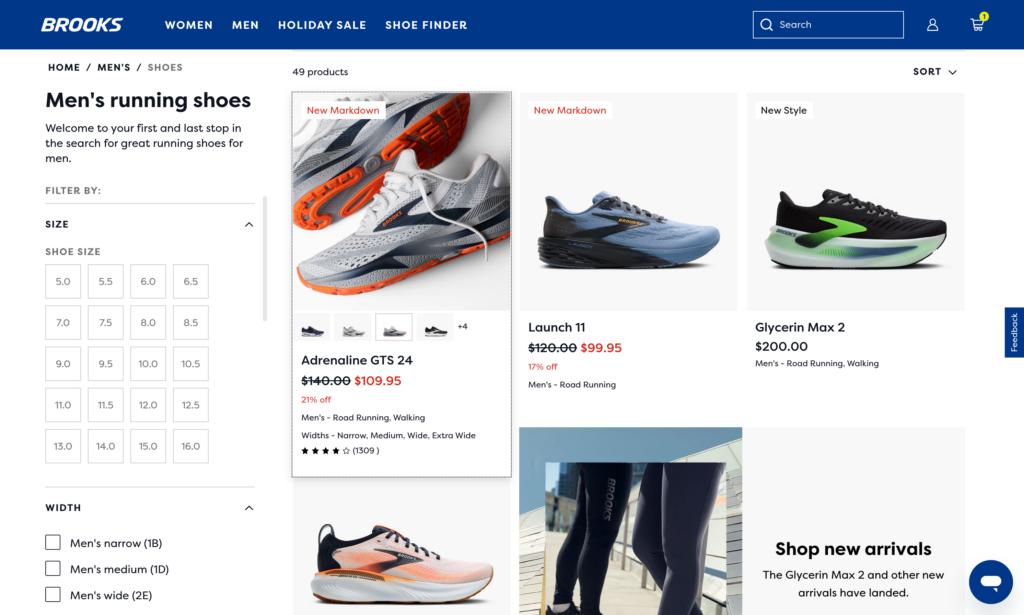
Implement faceted search and filtering
Faceted search (also called filtering) lets customers narrow down products by attributes like price, size, color, brand, or rating. It's the difference between showing someone 500 products and letting them find the exact blue, size medium, under-$50 shirt they want in three clicks.
Sites with good filtering see 34% better findability scores than those without. More importantly, customers who use filters are 2-3x more likely to purchase because they're actively hunting for something specific.
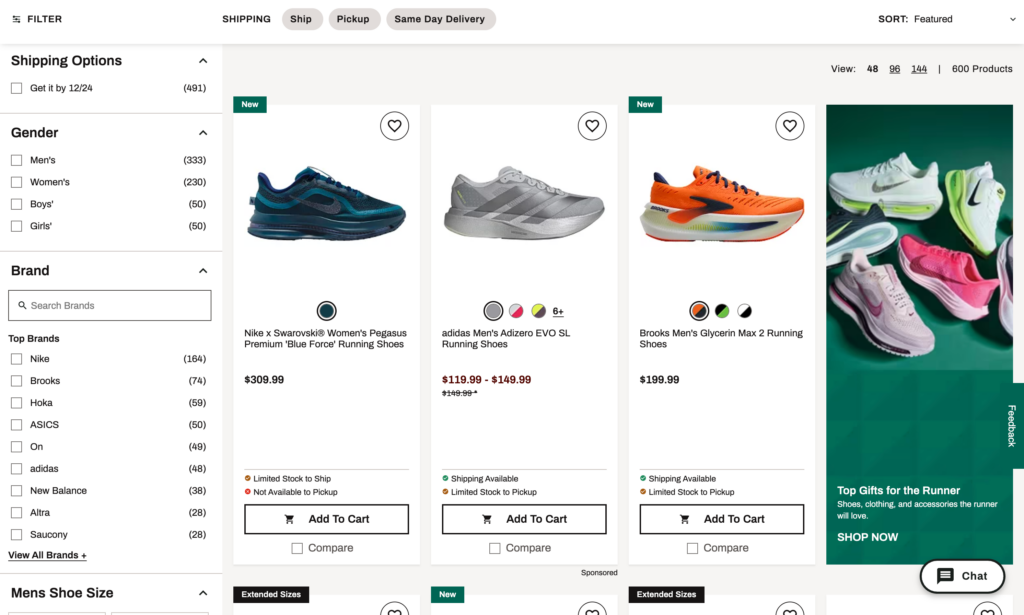
Essential filters for most stores:
Price range. Use a slider, not a dropdown—it's faster and more intuitive. Show the full price range with your current filter applied so customers know if they're missing cheaper/more expensive options.
Size/Color/Style. These are non-negotiable for apparel. For other industries, adapt to product attributes (capacity for luggage, watts for electronics, etc.).
Ratings. "4 stars and up" filtering lets quality-focused shoppers cut through the noise.
Availability. "In stock" filtering prevents the frustration of clicking on out-of-stock items.
Brand. If you carry multiple brands, let customers filter by their favorites.
What makes filtering work:
Show product counts next to each filter option. "Blue (27)" tells customers whether it's worth filtering by that color. If a filter would return zero results, grey it out or hide it.
Allow multiple selections within categories. Let customers select "Blue OR Red" and "Size M OR L" simultaneously. Single-selection filters frustrate 67% of users.
Display active filters clearly with easy removal. Show "Price: $20-50 [X]" and "Color: Blue [X]" so customers know what's filtering their results and can clear filters individually.
Don't reload the page for every filter change. Use AJAX to update results instantly. Page reloads feel slow and clunky—instant filtering feels modern and responsive.
Add smart search with autocomplete
Your search bar is often the fastest path to conversion. Customers who use search are typically high-intent shoppers who know what they want. Site search users convert at 2-3x the rate of non-searchers.
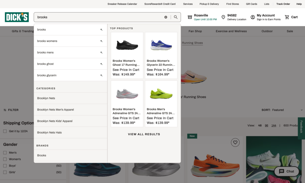
Search autocomplete (predictive search):
As customers type, show real-time suggestions with product images, names, and prices. This serves two purposes: it speeds up finding products and it inspires discovery (customers might see something they didn't know they wanted).
Autocomplete can reduce search interaction time by 15-30%. More importantly, it helps customers when they don't know exact product names or misspell words.
What makes autocomplete effective:
Show product images alongside text. When someone searches 'blue running shoes,' showing actual blue shoes immediately confirms they're on the right track—visual confirmation is instant and intuitive.
Include categories and pages in autocomplete results, not just products. If someone searches "return policy," show that page. If they search "men's jackets," show the category.
Handle typos and variations. "Tshirt," "t-shirt," and "t shirt" should all work. "Nike" and "Nikee" should return the same results. Research shows that approximately 10% of search queries contain spelling errors or typos.
Prioritize results intelligently. Show bestsellers or highest-rated items first, not random products that happen to match the keyword.
Highlight matching terms in search results so customers can quickly scan and verify relevance.
Display breadcrumbs for easy navigation
Breadcrumbs are the navigational trail showing exactly where customers are in your site hierarchy: Home → Men's → Shoes → Running Shoes. They seem like a small detail, but they significantly improve usability.
Breadcrumbs reduce the number of actions needed to navigate higher-level pages by 50%. They also improve SEO—Google uses breadcrumbs for rich snippets in search results.
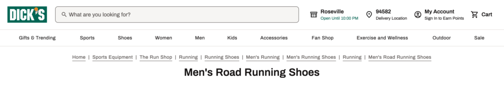
Where breadcrumbs matter most:
Product pages. Customers often land on product pages from Google or social media ads without seeing your homepage or category pages. Breadcrumbs give context: "You're looking at Men's → Outdoor → Hiking Boots → [Product Name]."
Deep category pages. If someone filters down to "Women's → Dresses → Cocktail Dresses → Red → Under $100," breadcrumbs let them back up one level at a time rather than starting over.
Best practices for breadcrumbs:
Make each level clickable. Breadcrumbs should be navigation, not just labels. Let customers click "Men's" to jump back to that category page.
Place them at the top of the page, above the product title or category heading. This is the standard location users expect.
Use separators, typically ">" or "/" to clearly distinguish levels. "Home > Category > Subcategory > Product" is immediately understandable.
Organize products with clear categorization
Poor product organization is invisible to you (you know where everything is) but painfully obvious to customers. If they can't find what they're looking for, they assume you don't have it—even if you do.
Category structure best practices:
Use customer language, not industry jargon. If you sell "athleisure," call it "Athletic Wear" or "Activewear"—terms customers actually search for. Don't make customers decode your categorization system.
Create collections strategically. Beyond basic categories (Men's/Women's, Product Type), create collections for common shopping patterns:
- Seasonal: "Summer Collection," "Holiday Gifts"
- Use case: "Gym Essentials," "Work-From-Home Setup"
- Price point: "Under $50," "Premium Collection"
- Bestsellers: "Top Rated," "Customer Favorites"
- New arrivals: "New This Week"
Avoid category overlap confusion. If a product logically fits in multiple categories (a blue men's shirt could go in Men's, Shirts, Blue Items, or Sale), that's fine—Shopify lets products appear in multiple collections. But make sure customers can find it through any logical path.
Test your categorization by asking someone unfamiliar with your store to find specific products. If they struggle, your organization needs work.
In Shopify, create collections under Products → Collections. Use automated collections (based on product tags, price, inventory level, etc.) for dynamic groups like "New Arrivals" or "On Sale." Use manual collections for curated groups like "Staff Picks."
Enhance product discovery
Show recently viewed products
Ever noticed how Amazon shows you "Products you've viewed" on almost every page? That's not decoration—it's a conversion tactic backed by behavioral psychology.
Recently viewed products serve several purposes. They help customers pick up where they left off without remembering exactly where they were. They encourage comparison shopping ("was this one better than the other one I looked at?"). And they act as gentle reminders of products the customer showed interest in but hasn't purchased yet.
Personalized product recommendations (including recently viewed) can boost conversions significantly. The psychology is simple: if someone looked at a product once, there's a higher likelihood they'll purchase it than a random product they've never seen.
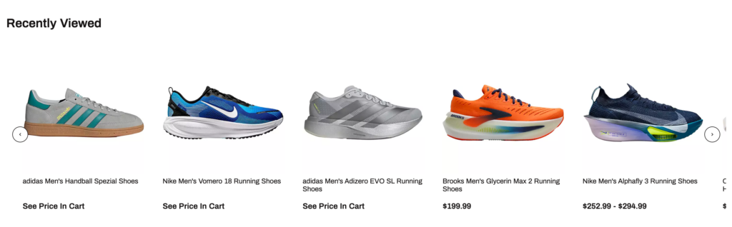
Where to display recently viewed:
Homepage. When customers return to your site, show them what they looked at last time. This speeds up re-engagement.
Product pages. A "Recently Viewed" section at the bottom of product pages helps comparison shopping and reminds customers of other options.
Cart page. If someone's about to check out but left something behind, a recently viewed carousel can prompt that add-on purchase.
Best practices:
Show 4-6 products in the carousel. More than that becomes overwhelming, fewer doesn't provide enough choice.
Include product images, names, and prices. Make these clickable thumbnails that load the full product page.
Update in real-time as customers browse. If they just viewed a product, it should appear in the carousel immediately.
Implement quick view functionality
Quick view lets customers see product details, images, and add-to-cart without leaving the collection page. It's the digital equivalent of picking up a product in a store for a closer look without committing to walking down a different aisle.
Quick view can reduce the interaction cost of browsing by up to 40%, especially for customers who are comparison shopping or browsing multiple items.
When quick view works best:
Collections with many similar products. If you're selling 50 different t-shirts, customers want to quickly compare features, colors, and prices without clicking into 50 different pages.
Comparison shopping scenarios. Electronics, furniture, or any category where customers weigh specs side-by-side benefit from quick view.
Mobile browsing. Quick view prevents the "back button fatigue" that happens when customers click into a product, back out, click the next one, back out, repeat 10 times.
What to include in quick view:
Product images with thumbnail navigation. Let customers see multiple angles without opening the full page.
Basic product details: name, price, available sizes/colors, key features.
Add to cart button. The whole point is to let customers purchase without leaving the collection page.
Link to full product page: "View Full Details" for customers who want reviews, descriptions, or specifications.
What NOT to include:
Don't cram every single detail into quick view—that defeats the purpose of "quick." Don't include full product descriptions or all 15 customer reviews. Keep it focused and fast.
Measuring technical performance
Technical optimization without measurement is guesswork. Track these metrics to understand your baseline, measure improvement, and identify new problems as they emerge.
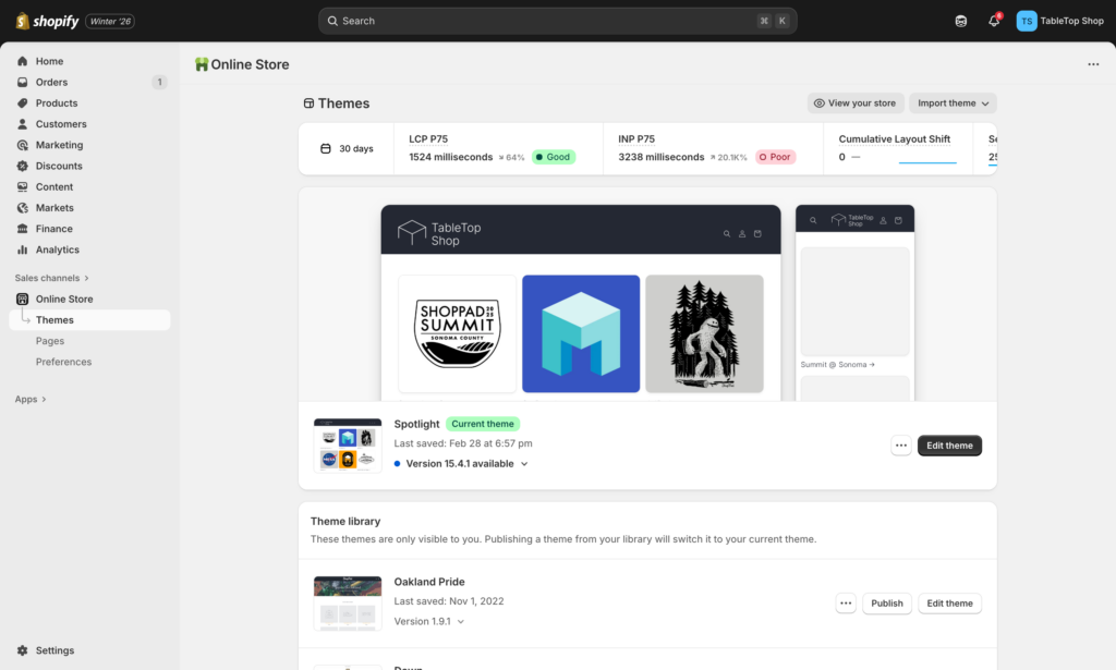
Site Speed Score (Shopify's built-in metric)
- Navigate to Online Store → Themes → View store speed
- Target: 50+ (Good), 70+ (Excellent)
- Track weekly to catch performance degradation early
- Focus on product page scores (where conversions happen)
Google PageSpeed Insights Mobile Score
- Run monthly at pagespeed.web.dev
- Target: 60+ for mobile (most important)
- Check specific pages: homepage, top 3 products, main collection page
- Screenshot and save reports to track trends over time
Core Web Vitals (from PageSpeed Insights)
- LCP (Largest Contentful Paint): Target under 2.5 seconds
- INP (Interaction to Next Paint): Target under 200 milliseconds
- CLS (Cumulative Layout Shift): Target under 0.1
- These directly impact Google rankings and user experience
On-Site Search Usage Rate
- Track in Analytics → Reports → Behavior → Search terms
- Calculate: Search sessions ÷ Total sessions
- Target: 15-30% (varies by store type)
- High search usage + poor results = immediate optimization opportunity
Search Result Conversion Rate
- Visitors who search typically convert 2-3x higher than non-searchers
- If your search users aren't converting better, your search is broken
- Track in Google Analytics: Search sessions → Add to cart → Purchase
Filter Usage on Collection Pages
- Most Shopify themes don't track this natively
- Use heatmap tools like Hotjar or Microsoft Clarity (free)
- Watch recordings of users struggling with filters—reveals usability issues
Bounce Rate by Page Type
- Product pages: Target under 50%
- Collection pages: Target under 60%
- Homepage: Target under 50%
- Higher bounce rates on mobile indicate mobile-specific problems
Create a simple spreadsheet with these columns:
- Date
- Overall Speed Score
- Mobile PageSpeed Score
- LCP / INP / CLS
- Product Page Bounce Rate (mobile)
- Search Usage Rate
- Notes (changes made that week)
Review every Monday morning (5 minutes). Compare month-over-month to identify trends. Flag any metric that drops more than 10% and investigate immediately.
Your technical CRO action plan
Technical optimization can feel overwhelming. Here's exactly how to prioritize and execute, from quick wins to long-term improvements.
Week 1: Establish your baseline
Day 1: Performance audit
- Run Shopify's Store Speed report (note your score)
- Run Google PageSpeed Insights on mobile (screenshot results)
- Test your top 3 product pages on actual mobile devices
- Document load times and any obvious issues
Day 2: Navigation audit
- Ask someone unfamiliar with your store to find 3 specific products
- Note where they struggle, how long it takes, what they click
- Test your site search with 5-10 common queries (products you sell)
- Check if search handles typos and shows relevant results
Day 3: Data collection
- Export key metrics from Shopify Analytics (conversion by device, bounce rates)
- Note your current mobile vs. desktop conversion gap
- List all installed apps and when you last used each one
Week 2: Quick wins
Speed quick wins:
- Compress all product images using TinyIMG app
- Remove apps you haven't used in 30+ days
- Delete leftover code from uninstalled apps in theme files
- Enable lazy loading if not already active
Navigation quick wins:
- Add search autocomplete if missing
- Enable breadcrumbs on product pages
- Add "Recently Viewed" to homepage and cart
- Simplify mobile menu to 5-7 top categories
Month 1: Foundation building
Weeks 3-4: Core optimizations
- Complete mobile optimization review (test on multiple devices)
- Implement faceted filtering on collection pages
- Add product count badges to filter options
- Optimize Core Web Vitals issues flagged in PageSpeed Insights
- Set up weekly performance monitoring routine
Test and measure:
- Compare Week 4 metrics to Week 1 baseline
- Note which changes had biggest impact
- Identify remaining high-priority issues
Months 2-3: Advanced optimization (ongoing)
Monthly tasks:
- Comprehensive app performance audit
- Mobile vs. desktop conversion gap analysis
- Search term analysis (what are people searching that returns no results?)
- Navigation heatmap review (where are people clicking/struggling?)
Quarterly tasks:
- Full theme performance review
- Consider theme upgrade if current theme is a bottleneck
- Competitive analysis (test competitor navigation and search)
- Update mobile optimization as devices and browsers evolve
Prioritization by store type
High-Traffic Stores (5,000+ monthly visitors): Priority 1: Site speed (every second matters at scale) Priority 2: Search functionality (high-intent users need to find products fast) Priority 3: Mobile optimization (where most traffic is)
Low-Traffic Stores (<2,000 monthly visitors): Priority 1: Mobile optimization (disproportionate impact) Priority 2: Navigation clarity (prevent the few visitors you get from bouncing) Priority 3: Speed (still important but lower impact at low volume)
Product Catalog Stores (100+ SKUs): Priority 1: Faceted filtering and search (critical for product discovery) Priority 2: Clear categorization (prevents overwhelming customers) Priority 3: Speed (matters but secondary to findability)
The maintenance mindset
Technical optimization isn't a project with an end date—it's ongoing maintenance. Performance degrades naturally as you add products, install apps, and make changes. Set recurring calendar reminders:
- Weekly: 5-minute speed check every Monday
- Monthly: 30-minute comprehensive performance review
- Quarterly: 2-hour deep audit with mobile testing
The stores that win at technical CRO aren't those that achieve perfection once—they're the ones that consistently maintain and improve their technical foundations month after month.
Start today: Pick one item from the Week 1 checklist and complete it in the next hour. Every improvement compounds. Every second saved translates to conversions gained.
Automate your technical monitoring: MESA can alert you when site performance drops, inventory runs low, or customer behavior patterns change—helping you catch technical issues before they hurt conversions.
Beyond site speed: Your complete CRO strategy
Start with strategy:
- Shopify Conversion Rate Optimization: Complete Strategy Guide
(New to CRO? Start here for the complete framework)
Explore related tactics:
Ready to scale?
- Shopify Automation for CRO: Scale Your Optimization Without More Work
(Automate these tactics to save time and increase consistency)
Frequently asked questions
How fast should my Shopify store load?
Your Shopify store should load in under 3 seconds on mobile. Google research shows 53% of mobile visitors abandon sites that take longer than 3 seconds. Aim for a Google PageSpeed Insights mobile score above 50 (acceptable), ideally 70+ (excellent). Desktop scores above 80 are common. According to Akamai research, each one-second delay in page load time reduces conversions by 7%, making speed a direct revenue driver, not just a user experience metric.
What slows down my Shopify store the most?
Images are the biggest culprit, typically accounting for 50-70% of page weight. Unoptimized product images over 200KB dramatically slow loading. The second major issue is app bloat—stores with 10+ apps experience 30-40% performance drops according to Shopify research. Other common issues include heavy theme code, lack of image lazy loading, excessive JavaScript from tracking tools, and uncompressed files. Address images and apps first for the biggest speed improvements with minimal effort.
How do I check my Shopify site speed?
Use Google PageSpeed Insights (pagespeed.web.dev) for detailed performance analysis—test your homepage and top product pages on mobile. Shopify's built-in speed report (Online Store → Themes → View store speed) provides an overall score and shows each app's performance impact. GTmetrix offers waterfall charts showing exactly what loads when. Test on actual mobile devices with cellular connections, not just desktop simulators, to see real-world performance. Check weekly to catch performance degradation early.
What are Core Web Vitals and why do they matter?
Core Web Vitals are Google's user experience metrics that affect search rankings: Largest Contentful Paint (LCP) measures how quickly your main content loads (target: under 2.5 seconds), Interaction to Next Paint (INP) measures responsiveness to clicks (target: under 200 milliseconds), and Cumulative Layout Shift (CLS) measures visual stability (target: under 0.1). These directly correlate with conversion rates—poor Core Web Vitals mean slower experiences that drive customers away. Improve them through image optimization, JavaScript reduction, and proper element sizing.
Do Shopify apps really slow down my store?
Yes, significantly. Many app adds JavaScript, CSS, and API calls that impact loading speed. Shopify research shows stores with 10+ apps can experience 30-40% performance drops. Check your Store Speed Report (Online Store → Themes → View store speed) to see each app's specific impact. Conduct monthly app audits—remove apps you haven't used in 30+ days. Even disabled apps often continue loading code. After uninstalling, check theme files for leftover code snippets that need manual removal.
What's the best image size for Shopify product pages?
Product images should be 2048×2048 pixels maximum, compressed to under 200KB each. Use JPG format for photos (better compression) and PNG only when you need transparency. Modern Shopify themes use responsive images that serve appropriate sizes to different devices—verify this works by checking mobile image dimensions. Compress all images before uploading using TinyPNG or install the TinyIMG app for automatic optimization. Images are 50-70% of page weight, making this optimization your highest-impact speed improvement.
How do I improve Shopify navigation and search?
Limit your main navigation to 5-7 top-level categories following Miller's Law—too many options create decision paralysis. Implement faceted filtering so customers can narrow products by price, size, color, and rating. Add search autocomplete with product images for faster discovery—site search users convert at 2-3x the rate of non-searchers according to Econsultancy. Display breadcrumbs on product pages, organize collections by customer intent (seasonal, use case, price point), and ensure mobile navigation uses thumb-friendly buttons minimum 44px tall.
What is faceted search and filtering?
Faceted search (also called filtering) lets customers narrow products by multiple attributes simultaneously—price range, size, color, brand, rating, or availability. Instead of showing 500 products, customers find their exact blue, size medium, under-$50 shirt in three clicks. According to Baymard Institute, sites with good filtering see 34% better findability and customers who use filters are 2-3x more likely to purchase. Essential filters include price (use slider), size/color (multiple selections allowed), ratings (4+ stars), and in-stock availability.
Should I use a mega menu on my Shopify store?
Use a mega menu if you have 50+ products across multiple categories. Mega menus show all navigation at once with images and subcategories, helping customers navigate without multiple clicks. Companies like Nike and REI use them effectively. Best practices: include product images in dropdowns, highlight featured categories, keep the menu open until users move away, and make it work on mobile with accordion-style expansion. For smaller catalogs (under 50 products), standard dropdown menus work fine and load faster.
How often should I audit my Shopify store's technical performance?
Check your speed score weekly (every Monday, 5 minutes) using Shopify's built-in Store Speed report to catch issues early. Run comprehensive monthly audits (30 minutes) reviewing app performance, mobile optimization, and Core Web Vitals via Google PageSpeed Insights. Conduct quarterly deep reviews (2 hours) including theme performance assessment, competitive analysis, and mobile device testing. Performance degrades gradually as you add products, apps, and customizations—regular monitoring prevents serious problems before they significantly impact conversions and revenue.
