Shopify product page optimization starts with understanding this reality: your product pages convert at just 2-3% on average. That means 97 out of every 100 visitors leave without buying.
Product pages are among your highest-traffic pages. Most visitors land directly on product pages from Google, social ads, or Pinterest—never seeing your carefully crafted homepage. If you're getting 10,000 monthly visitors, 4,000-6,000 are hitting product pages first.
That makes product page optimization the highest-leverage CRO activity you can do. A 1% conversion improvement can translate to 20-30% more revenue without spending another dollar on ads.
High-converting product pages answer five questions in 6-8 seconds: Can I trust this? Is it worth the price? What if I don't like it? Why buy now? Is this site legit? We'll cover exactly how to answer each through images and video, customer reviews and social proof, strategic pricing and promotions, plus urgency and trust signals that drive action without manipulation.
Your visitors are interested. Let's give them every reason to buy.
Understanding product page performance
Before optimizing anything, you need to know which product pages are actually underperforming. Throwing tactics at your entire catalog is inefficient—focus on the pages with the biggest opportunity for improvement.
Finding your problem pages in Shopify
What you're looking for: high-traffic pages with low conversion rates. These are your biggest opportunities. A product getting 500 monthly visits but converting at 0.5% is hemorrhaging potential revenue. Fix that one page and you could add 10-15 orders monthly.
Create a simple spreadsheet with your top 20 products by traffic, then note their conversion rates, bounce rates, and add-to-cart rates. The worst performers get optimization priority.
The 4 metrics that matter
Bounce Rate measures the percentage of visitors who leave without interacting. Industry average is 40-60% for product pages. Above 70% signals major problems—poor images, confusing information, or slow load times. Below 30% is excellent.
Time on Page indicates engagement level. Average is 45-90 seconds. Under 30 seconds means visitors aren't reading descriptions or exploring images. Over 2 minutes might mean confusion—customers can't find the information they need.
Add-to-Cart Rate is critical: visitors who added to cart ÷ total product page visitors. Ecommerce average is 8-12%. Below 5% indicates weak product pages. Above 15% is excellent.
Conversion Rate (product page specific) shows completed purchases from product page visitors. Average is 2-3% overall, but varies significantly:
- Fashion/Apparel: 1-2%
- Electronics: 1.5-2.5%
- Health & Beauty: 2-3%
- Home Goods: 2-4%
- Specialty/Niche: 3-5%
Diagnosing specific problems
High traffic + low add-to-cart rate? Your product page isn't convincing. Focus on images, descriptions, reviews, and social proof.
Good add-to-cart rate + low conversion? The problem is downstream—checkout friction, shipping costs, or payment options.
High bounce rate + low time on page? Visitors aren't finding what they expected. Check if your product title matches the ad/link they clicked, improve first-impression elements like the hero image, or speed up page load time.
Long time on page + low conversion? Customers are confused or missing critical information. Add FAQ sections, improve size guides, clarify shipping/returns, or simplify overwhelming product options.
Track these metrics monthly for your top products. A sudden drop in performance often indicates a specific problem—out-of-stock variants showing, broken images, or a competitor offering better pricing. Catch these issues early and fix them fast.
Perfect your product page
Your product page is where browsers become buyers. Get it wrong, and visitors bounce. Get it right, and you've got a conversion machine that works 24/7.
The difference between a 1% and 3% conversion rate on product pages? That's potentially triple your revenue from the same traffic. Let's break down exactly how to create product pages that convert.
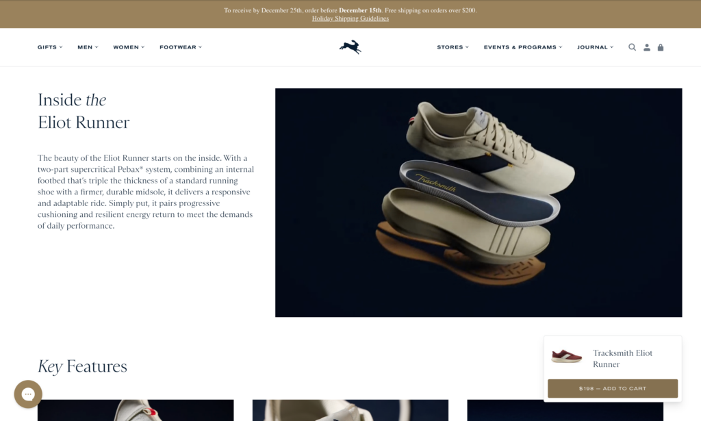
Show, don't just tell: Images and video that sell
Your product images are doing most of the heavy lifting on your product pages. In ecommerce, customers can't touch or try your products, so your visuals need to bridge that gap.
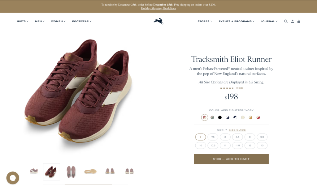
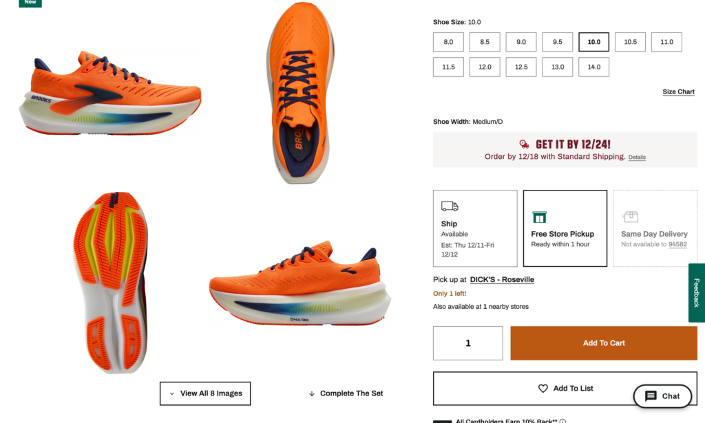
Multiple angles matter. Show your product from every important perspective—front, back, side, top, detail shots. Don't make the mistake that Big5 Sporting Goods made: showing a camping backpack from only one angle leaves customers guessing about pockets, straps, and capacity. Show at least 4-6 different angles so customers can mentally "rotate" the product in their minds.
Lifestyle shots build desire. Product-only photos on white backgrounds are fine for specifications, but lifestyle images help customers envision themselves using your product. A coffee mug looks functional on white. That same mug in someone's hands on a cozy morning? That sells the experience, not just the product.
Product videos drive serious results. According to research by EyeView, adding video to product pages can increase conversions by up to 86%. Videos show products in action, demonstrate scale, and answer questions before customers even ask them. Keep videos under 60 seconds—show the product being unboxed, used, and highlight 2-3 key features. Tools like Canva or InVideo make it easy to create simple product videos without expensive equipment.
Zoom functionality is non-negotiable for products where details matter—jewelry, watches, apparel with unique textures, electronics with ports and buttons. Shopify themes typically include zoom by default, but test it on mobile to ensure it works smoothly.
Don't forget image optimization. Those gorgeous 5MB product photos? They're killing your page speed and your conversion rate. Compress images to under 200KB using tools like TinyPNG or the TinyIMG Shopify app. Use JPG for photographs and PNG only when you need transparency. Remember: every second of page load time costs you conversions.
Write product descriptions that convert
Here's what most Shopify stores get wrong: they write descriptions like instruction manuals instead of sales copy.
Lead with benefits, not features. Don't say "304 stainless steel construction." Say "Won't rust or corrode, even after years of daily use." Features tell what it is. Benefits tell what it does for the customer. Every feature should answer the customer's silent question: "So what? Why does this matter to me?"
Tell a story. Great product descriptions paint a picture. Instead of "Wireless noise-canceling headphones with 30-hour battery," try: "Block out airplane chatter and focus on your podcast. Thirty hours of battery life means you'll fly from New York to Singapore without reaching for your charging cable." See the difference? One describes the product. The other describes the experience.
Address objections head-on. What makes customers hesitate? Is it sizing? Durability? Complexity? Your product description should anticipate and answer these concerns. If customers always ask "Will this work with my iPhone?" in your emails, answer it prominently in the description.
Format for scannability. Most people skim product pages. Use short paragraphs (2-3 sentences max), subheadings to break up content, and bullet points for quick-reference specs. Put the most important information in the first 150 words—that's all mobile users see before "read more."
Optimize for SEO without sounding robotic. Include your target keywords naturally in the product title, first paragraph, and image alt text. If you sell "organic cotton baby clothes," use variations like "organic baby clothing" and "cotton baby outfits" throughout the copy. Tools like Shopify's SEO features make this straightforward.
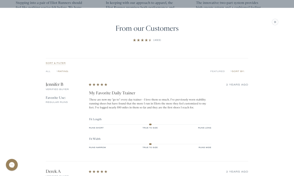
Leverage reviews and social proof strategically
Here's a stat that matters: 90% of customers read online reviews before making a purchase. No reviews? You're fighting an uphill battle.
Choose the right review app. For Shopify stores, Judge.me is hard to beat—it has 40,000+ reviews with a perfect 5.0 rating and offers an excellent free plan with photo/video reviews. If you're selling visually-driven products like fashion or beauty, Loox specializes in gorgeous photo review displays. Larger brands with bigger budgets might consider Yotpo for enterprise-level features and integrations.
Place star ratings above the fold. Don't hide your social proof. Display your average star rating and review count prominently near your product title and price. This builds immediate trust and often increases clicks to read full reviews.
Make photo and video reviews prominent. Reviews with customer photos convert significantly better than text-only reviews. They provide authentic proof that real people bought and used your product. Incentivize photo reviews with a small discount on the next purchase—most review apps make this easy to automate.
Enable review filtering and sorting. Let customers filter reviews by star rating, keyword, or reviewer characteristics (verified purchase, photo reviews only). When customers can find reviews that match their concerns—like "How does this fit?" or "Is it durable?"—they're more likely to convert.
Respond to reviews, especially negative ones. Shoppers read how you handle complaints. A thoughtful response to a 3-star review actually builds more trust than a page of only 5-star reviews (which often looks fake). Address concerns, offer solutions, and show you care about customer satisfaction.
Add smart product recommendations
Amazon didn't build a trillion-dollar business by showing customers just one product at a time. Strategic recommendations increase average order value and make the shopping experience better.
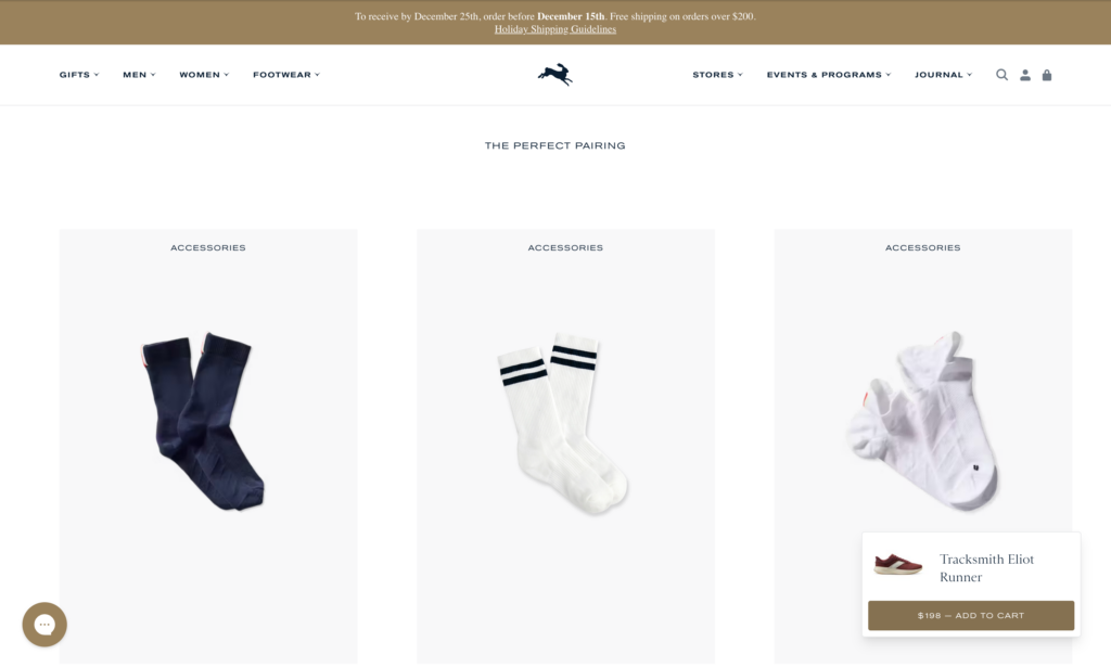
"Frequently Bought Together" works. Show complementary products that other customers purchased together. Selling a camera? Suggest memory cards and a carrying case. This simple tactic can increase AOV by 10-30%.
Cross-sells and upsells need positioning. Place upsells (more expensive versions of the same product) near the product description where customers are still evaluating options. Place cross-sells (complementary products) near the add-to-cart button or on the cart page when buying intent is already established.
Test AI-powered recommendations. Shopify's built-in recommendation features use machine learning to suggest products based on browsing behavior, purchase history, and similar customer patterns. These often outperform manual recommendations because they adapt to individual shopping behavior.
Test, measure, refine. The best placement and style for recommendations varies by store. Use Shopify's analytics or Google Analytics to track how many customers click on recommendations and what percentage add those items to their cart. Test different positions—sidebar versus below the fold versus pop-ups—and double down on what works.
Your product pages are your digital salespeople. Invest the time to optimize them, and they'll reward you with higher conversion rates and more revenue from every visitor you send their way.
Pricing & promotion tactics
Pricing isn't just about covering costs and making profit—it's psychological warfare. The difference between $49.99 and $50.00? Negligible in actual dollars. Massive in perceived value.
Strategic pricing and smart promotions can increase your conversion rate without changing a single thing about your product. Let's break down the tactics that actually work.
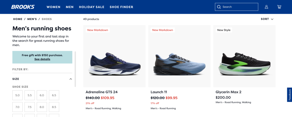
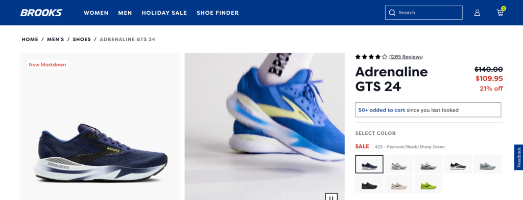
Strikethrough pricing: Show the "Before" price
When customers see "$99.99 $79.99" their brain doesn't just see a sale—it sees concrete savings of $20. This technique, called price anchoring, leverages a cognitive bias where the first price we see becomes our reference point for value.
The strikethrough creates instant context: "This normally costs $99.99, so $79.99 is a great deal." Without that anchor, customers have no framework to judge whether $79.99 is expensive or cheap.
Best practices for strikethrough pricing:
Make sure your "original" price is legitimate. Don't inflate it just to make the discount look bigger—this is illegal in many jurisdictions and destroys customer trust when discovered.
Place the strikethrough price before the sale price (left to right reading). The original price establishes the anchor, then the sale price delivers the payoff.
Use contrasting colors. Original price in gray or with a strikethrough, sale price in red or green to draw the eye.
Where to use it: Sale pages, seasonal promotions, clearance items, or when introducing "everyday low pricing" compared to MSRP.
Price anchoring: Frame value with context
Price anchoring goes beyond just strikethrough pricing. It's about showing customers a higher-priced option to make your target option seem more reasonable.
The classic "Good-Better-Best" approach: Offer three tiers of your product or service. Most customers will choose the middle option—it feels like a smart compromise between "cheap" and "too expensive."
Example:
- Basic Plan: $29/month
- Professional Plan: $49/month (Most Popular!)
- Enterprise Plan: $99/month
Even if you want customers on the $49 plan, having the $99 option makes $49 feel like a bargain. The Basic plan makes the Professional plan feel substantial, and the Enterprise plan makes Professional pricing look reasonable.
Shopify's built-in product variant system makes tiered pricing straightforward. Create variants for different packages or bundles, and highlight your target tier as "Most Popular" or "Best Value."
Psychological pricing (.99 Endings)
This is the oldest trick in the pricing playbook, and it still works. Research shows that changing a price from $100 to $99 can increase sales by more than 40%. According to ProfitWell's analysis of 18,000 companies, businesses using .99 endings see an average 3-4% conversion rate increase.
Why does our brain care about one cent? The "left-digit effect"—we process prices from left to right, anchoring on the first number. $19.99 feels closer to $19 than $20, even though mathematically it's almost the same.
When to use .99 pricing:
- Mid-range products where you want to convey value
- Sale or promotional pricing
- Products targeting price-conscious shoppers
- Items under $100
When to avoid .99 pricing:
- Luxury or premium products (round numbers like $100 signal quality)
- Professional services where you want to project expertise
- High-end brands where precise pricing might feel cheap
The beauty of .99 pricing is its simplicity. Change your $30 item to $29.99 and test it for 30 days. Track the conversion rate difference. If it works for your audience, expand it across your catalog.
Bundle discounts: Increase AOV while adding value
"Buy the camera, lens, and bag separately for $847, or get the Complete Photography Bundle for $699" — that's a no-brainer for many customers.
Bundles increase average order value while making customers feel smart. They're getting more stuff for less money per item. You're moving more inventory and increasing cart size.
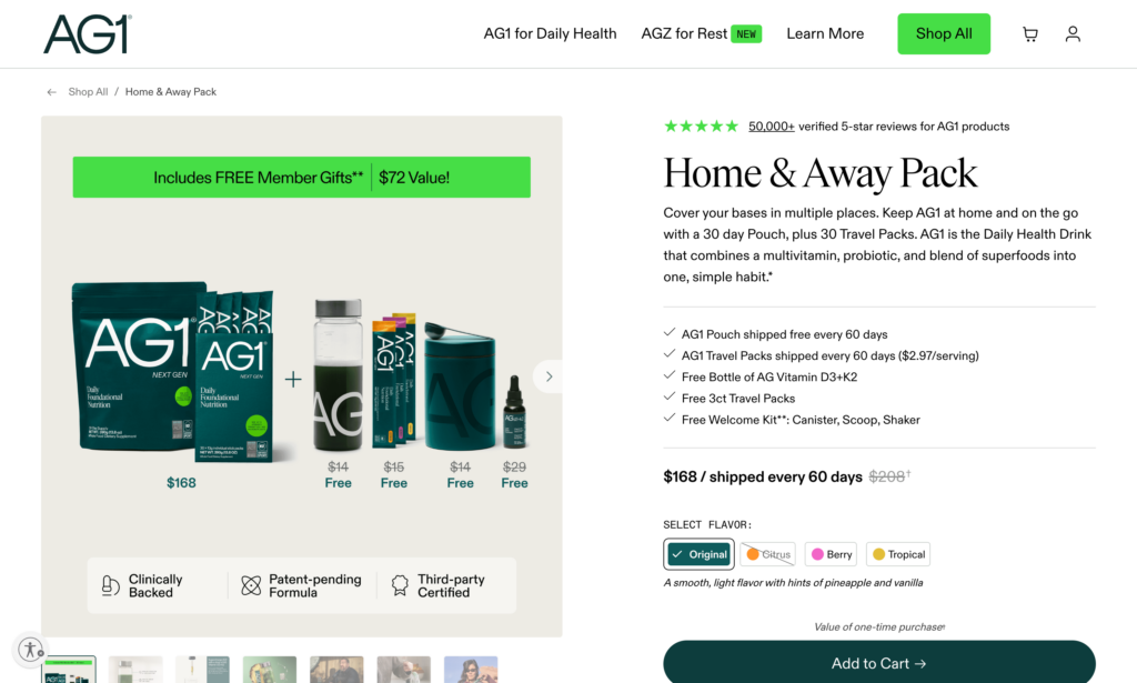
Types of bundles that work:
Complementary products: Items frequently bought together (shampoo + conditioner, laptop + mouse + case)
Complete solutions: Everything someone needs to get started (beginner guitar bundle with picks, strap, tuner, case)
Themed collections: "Date Night Bundle," "Home Office Setup," "Winter Essentials"
Good-Better-Best bundles: Give customers three bundle options at different price points
Create bundles using Shopify's native product bundling or apps like Infinite Options. Calculate your bundle discount to be profitable while feeling generous—typically 10-25% off buying items separately.
Volume pricing: Reward bulk purchases
"Buy 1 for $20, Buy 3 for $50" — volume pricing encourages customers to buy more units by lowering the per-unit cost.
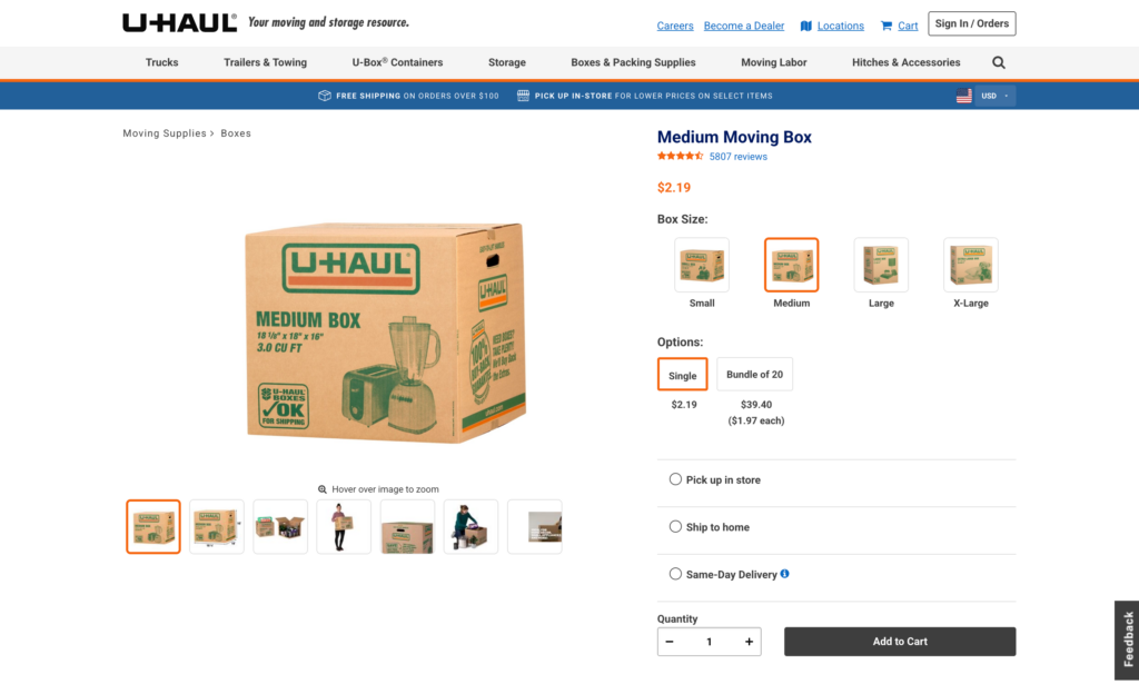
This works especially well for consumable products, products with low marginal costs, or wholesale/B2B scenarios.
Use quantity discounts in your product setup or apps like Wholesale Club. Display the savings clearly: "Save $10 when you buy 3!"
Pro tip: Make the volume tier just out of reach for the average purchase. If customers typically buy 2 units, make the deal activate at 3 units. This nudges them to increase their cart.
Limited-time offers with countdown timers
"SALE ENDS IN 4 HOURS 23 MINUTES" — countdown timers create urgency by visualizing time slipping away.
The psychology is simple: fear of missing out (FOMO) plus loss aversion (the pain of missing a deal is stronger than the pleasure of getting it). Research shows countdown timers can increase conversions by anywhere from 9% to 300%, depending on context and implementation.
What works:
Flash sales with real deadlines: "24-Hour Flash Sale ends at midnight" with a countdown timer creates genuine urgency. Research by CXL found one company adding urgency messaging with a countdown timer increased conversions by 147%.
Shipping deadline timers: "Order in the next 3 hours 17 minutes for delivery by Friday" solves a real customer problem and increased one company's revenue by 9%.
Cart expiration timers: "Your cart is reserved for 15 minutes" encourages checkout completion. This works best for high-demand items or event tickets.
What doesn't work:
Fake urgency: If your "24-hour sale" resets every day, customers notice. A study found that 68% of shoppers report feeling manipulated by perpetual countdown timers. Once trust is broken, it's hard to rebuild.
Critical rule: Only use countdown timers for genuine deadlines. Flash sale ending at midnight? Perfect. Inventory actually running low? Great. Made-up urgency? Brand damage.
Strategic pricing isn't about tricks—it's about presenting your prices in ways that help customers make decisions. Free shipping thresholds encourage larger orders. Anchor prices provide context. Psychological pricing reduces perceived cost. Bundles add value. Countdown timers create genuine urgency.
Test these tactics systematically. Start with free shipping thresholds (biggest impact, easiest to implement), then add .99 pricing, then experiment with urgency and bundles. Track your conversion rate and AOV for each change. What works for one store might not work for another—your data will tell you the truth.
Urgency & scarcity tactics
We covered countdown timers and time-based urgency in the pricing section. Now let's talk about scarcity—the fear that something might run out before you can get it.
Urgency says "act now or lose the opportunity." Scarcity says "act now or someone else will take it." Both trigger the same psychological response: loss aversion, the pain of missing out on something valuable.
The difference? Urgency is about time constraints. Scarcity is about limited availability. And when you combine both? That's when conversions really take off.
Low stock indicators: The FOMO trigger
"Only 3 left in stock" is one of the most powerful conversion tools in ecommerce. According to research by CXL, showing real-time stock levels increased conversion rates by up to 17.8% in high-traffic ecommerce stores.
Why does this work? A 1975 study by researchers Worchel, Lee, and Adewole used two identical jars of cookies—one with 10 cookies, one with 2. Participants rated the cookies from the jar with only 2 as more valuable, even though the cookies were exactly the same. Scarcity changed their perception of value.
Best practices for low stock indicators:
Be honest. Don't fake scarcity. If you have 500 units in your warehouse, don't display "Only 2 left!" That's not just unethical—it's illegal in many places and destroys customer trust when discovered.
Set threshold triggers. Display stock levels only when inventory drops below a certain number. "Only 7 left in stock" creates urgency. "127 in stock" does not. Most stores trigger low stock warnings at 10 units or fewer.
Update in real-time. If someone buys the last unit while another customer is browsing, the stock count should update immediately. Nothing kills urgency like a "low stock" indicator that never changes.
Placement matters. Display low stock warnings near the Add to Cart button where purchase decisions happen. Make it visually distinct—a red or orange badge catches attention without being obnoxious.
Limited-time promotions: Create windows of opportunity
We talked about countdown timers in the previous section. Here's how to structure the promotions they support.
Flash sales work because they're events. "20% off everything—today only!" creates a clear window. Customers know that if they don't act today, they'll pay full price tomorrow.
A University of Nebraska study found that retailers have a significant advantage in compelling shoppers to make instant decisions by creating scarcity. The research showed that scarcity entices customers to "Buy Now" as they anticipate regretting missing the deal later—even when customers know the scarcity is deliberately created.
Types of limited-time promotions that convert:
Daily or weekly deals: "Monday Flash Sale: 40% off all winter coats" creates anticipation and repeat visits. Customers learn to check back regularly.
Hour-specific sales: "Happy Hour Sale: 3-5pm today only" works especially well for specific time zones or to drive traffic during slow hours.
First X customers: "First 100 orders get free shipping + 20% off" combines time scarcity with quantity scarcity. Once 100 people claim it, it's gone.
Seasonal closeouts: "Winter clearance—save up to 70% while supplies last" leverages natural urgency around changing seasons.
The key to success: Promote these ahead of time via email, social media, and SMS so customers anticipate them. Then use countdown timers during the sale to maintain urgency throughout.
"X people viewing this" + Recently sold notifications
Booking.com mastered this tactic: "23 people are looking at this hotel right now" + "Booked 7 times in the last 24 hours."
This works on two levels. First, it's social proof—if 23 people are interested, it must be good. Second, it triggers FOMO—if all these people are looking, someone might buy it before I do.
Real-time activity indicators that work:
"X people viewing this right now" – Shows live interest in the product. Works best for products with genuinely high traffic.
"X sold in the last 24 hours" – Demonstrates recent purchase activity. More believable than lifetime sales numbers.
"X people have this in their cart" – Creates urgency around limited stock without explicitly stating inventory levels.
"Recently purchased by someone in [City]" – Adds geographic social proof. "Someone in San Francisco just bought this" feels more real and relatable than anonymous purchases.
Implementation strategy:
Use these notifications strategically, not on every product. They work best for bestsellers, trending items, or products you want to push.
Make sure the numbers are accurate. Show real data, not fake activity.
Don't overwhelm the page. One or two social proof indicators near the Add to Cart button is plenty. More than that starts to feel manipulative.
Combine with scarcity for maximum impact. For example: "Only 5 left in stock" + "8 people viewing this right now" + "Sold 12 times today" tells a story: this product is popular, inventory is low, and you might miss out if you wait.
Seasonal and holiday urgency: Leverage natural deadlines
Certain times of year come with built-in urgency. You don't need to manufacture it—just remind customers it exists.

Holiday shopping deadlines: "Order by Dec 20 for guaranteed Christmas delivery" solves a real problem. Customers are already motivated to buy; you're just removing uncertainty about timing.
Back-to-school season: "Get your dorm room essentials before classes start August 28" creates a natural deadline tied to external events.
Tax season: "Spend your tax refund on something you'll actually use" capitalizes on a moment when people have extra cash and are already in spending mode.
Seasonal transitions: "Last chance for summer styles—fall collection drops next week" leverages the natural scarcity of seasonal inventory.
How to maximize seasonal urgency:
Start early with anticipation: Begin promoting holiday shopping in October, not December. "120 days until Christmas—shop early for best selection."
Create milestone deadlines: "Order by December 10 for standard shipping" → "Order by December 15 for express shipping" → "Order by December 20 for overnight shipping." Multiple deadlines give customers several chances to act.
Use shipping deadline timers: "Order in the next 4 hours 23 minutes for delivery before Christmas" combines countdown timers with seasonal urgency.
Post-holiday clearance: "50% off all holiday inventory—while supplies last" leverages the natural clearance cycle to move seasonal inventory.
Mobile product page optimizations
Over 70% of Shopify traffic comes from mobile devices, yet mobile conversion rates typically lag desktop by 30-50%. If your desktop converts at 3%, mobile might only hit 1.5-2%. That gap represents massive lost revenue.
The problem isn't that mobile shoppers are less serious—it's that most product pages are designed for desktop and merely "responsive" for mobile. They technically work on small screens, but the experience is clunky, frustrating, and conversion-killing.
The mobile conversion gap
Compare conversion rates across desktop, mobile, and tablet. If mobile is converting at less than 70% of your desktop rate, mobile optimization should be your top priority.
Common culprits: images that load slowly on cellular connections, text that's too small to read comfortably, buttons that are too small to tap accurately, and descriptions that require endless scrolling.
Optimize images for mobile loading
Mobile users often browse on slower cellular connections. A product page with eight 2MB images takes 15-20 seconds to fully load on 4G—an eternity when the average attention span is 8 seconds.
Image optimization checklist:
- Compress all images to under 200KB using TinyPNG or the TinyIMG app
- Serve images at appropriate sizes—don't force mobile devices to download 3000px images and scale them down
- Use lazy loading so images load as users scroll (most modern Shopify themes do this automatically)
- Place your best product image first—it loads immediately while others load in background
Test your mobile page speed with Google PageSpeed Insights. Aim for a mobile score above 70. Below 50 means you're losing conversions to slow load times.
Design thumb-friendly buttons
Apple's Human Interface Guidelines recommend minimum tap targets of 44×44 pixels. Many Shopify themes use 30-35px buttons on mobile—technically tappable but frustrating.
Your "Add to Cart" button should be:
- Minimum 48px tall (preferably 50-60px)
- Full-width or nearly full-width on mobile (easier to hit)
- Sticky to the bottom of screen as users scroll (always accessible)
- High-contrast color that stands out from the page
- Clear, action-oriented text: "Add to Cart" not "Add" or icons alone
Test by actually using your thumb on a real device. If you occasionally miss or misclick, your customers are too—and they're bouncing instead of trying again.
Simplify content for small screens
Desktop users tolerate long descriptions because they have screen real estate. Mobile users scroll through paragraphs of text on a 6-inch screen and abandon before reaching the "Add to Cart" button.
Mobile content strategy:
- Front-load the most important information: key benefits in first 2-3 sentences
- Use shorter paragraphs (2-3 sentences maximum)
- Break up text with subheadings for scanability
- Use bullet points for features/specs rather than paragraph format
- Consider collapsible accordions for secondary information (shipping, returns, specs)
Keep descriptions to 150-200 words for mobile-first products. Users can expand "Read More" if they want details, but don't force them to scroll through everything.
Simplify mobile navigation
Product image galleries: Use swipeable carousels with large, tappable thumbnail dots below. Avoid tiny thumbnails that are hard to tap accurately.
Variant selection: Make size/color selectors large touch targets (40px minimum). Display unavailable options as greyed-out but visible so customers know the full range.
Quantity selectors: Use large +/- buttons rather than tiny input fields where customers must type.
Quick view functionality is especially valuable on mobile. Let customers see basic info and add to cart without leaving the collection page, reducing back-button fatigue.
Test your entire mobile product page on multiple devices—iPhone, Android, different screen sizes. What works on an iPhone 14 Pro might be cramped on an iPhone SE. The Responsive Design Checker lets you preview multiple devices, but nothing replaces testing on actual hardware.
Mobile optimization isn't optional anymore—it's where most of your customers are. Every friction point on mobile is costing you 70% of your potential conversions.
Your product page optimization action plan
You've learned the tactics. Now let's turn knowledge into revenue with a clear implementation roadmap.
Quick wins: The 2-hour sprint
If you only have two hours to improve product pages, focus on these high-impact changes:
Hour 1: Images & Content
- Add 2-3 additional product images to your top 10 products (different angles, lifestyle shots)
- Compress all product images for faster loading times
- Rewrite the first 2-3 sentences of your top 5 product descriptions to focus on benefits, not features
- Add or prominently display your money-back guarantee near the Add to Cart button
Hour 2: Trust & Urgency
- Install a review app (Judge.me has an excellent free plan)
- Add trust badges to product pages (payment logos, security seals)
- Enable inventory tracking and display low-stock alerts for bestsellers
- Test your top 3 products on mobile and fix any obvious button size or loading issues
These changes alone can boost product page conversions by 0.5-1%, which translates to 15-30% more revenue for most stores.
The 30-Day Transformation
Week 1: Foundation & Data
- Document current metrics for top 20 products (conversion rate, bounce rate, add-to-cart rate)
- Set up Google Analytics 4 product page tracking if not already active
- Audit all product images: identify products with fewer than 4 images or poor-quality photos
- Run mobile page speed tests on top 10 products (aim for 70+ score)
Week 2: Content & Visual Optimization
- Add lifestyle images to your 10 bestselling products
- Create or update product videos for your top 3-5 highest-value products
- Rewrite descriptions for underperforming products (high traffic, low conversion)
- Optimize all images for mobile (compress, resize, lazy loading)
Week 3: Social Proof & Trust
- Email recent customers requesting reviews for products they purchased
- Add photo/video review capabilities to your review app
- Create FAQ sections for products with high return rates or support questions
- Display "recently sold" or "X people viewing" notifications on bestsellers
Week 4: Psychology & Testing
- Implement urgency tactics on appropriate products (low stock alerts, limited-time offers)
- Add product bundling or "frequently bought together" recommendations
- Test one major change (button color, description format, image order) on your highest-traffic product
- Review week 4 metrics vs. week 1 baseline and plan next optimizations
Prioritize by store type
Fashion/Apparel Stores: Focus first on images (multiple angles, lifestyle shots, fit videos), size guides with real measurements, and style-specific filters. Add "recently viewed" and outfit bundling. Reviews with photos are critical for fashion—prioritize collecting them.
Electronics/Tech Stores: Lead with detailed specs in scannable format, comparison tables against competitors, and professional product videos showing features. Trust badges and warranty information are crucial. Focus on answering technical questions preemptively.
Home Goods/Furniture: Emphasize room setting images, dimension diagrams, and material close-ups. Add AR/visualization tools if budget allows. Shipping costs and delivery timeframes must be crystal clear upfront. Bundle coordinating items aggressively.
Health/Beauty/Consumables: Ingredient lists with explanations, before/after imagery (if truthful), usage instructions, and subscription options. Reviews are your primary conversion driver—prioritize collecting and displaying them prominently. Emphasize benefits over features.
Specialty/Niche Products: Educational content is key—explain what makes your product unique, how it solves specific problems, and why it's worth the price. Deep descriptions work better than short ones. Video demonstrations are highly effective. Build comparison content against cheaper alternatives.
Beyond products: Your complete CRO strategy
Start with strategy:
- Shopify Conversion Rate Optimization: Complete Strategy Guide
(New to CRO? Start here for the complete framework)
Explore related tactics:
Ready to scale?
- Shopify Automation for CRO: Scale Your Optimization Without More Work
(Automate these tactics to save time and increase consistency)
Frequently asked questions
What is product page optimization?
Product page optimization is the process of improving individual product pages to increase conversions and sales. It involves enhancing product images, writing compelling descriptions, adding customer reviews, displaying trust signals, implementing urgency tactics, and optimizing for mobile devices. The goal is to answer customer questions, overcome objections, and make the buying decision as easy as possible within the 6-8 seconds visitors spend evaluating a product.
What is a good conversion rate for a product page?
The average product page conversion rate is 2-3%, though this varies by industry. Fashion and apparel typically convert at 1-2%, electronics at 1.5-2.5%, health and beauty at 2-3%, home goods at 2-4%, and specialty/niche products at 3-5%. A conversion rate above 3% is considered excellent for most ecommerce stores. Product pages with optimized images, reviews, and clear calls-to-action can achieve 4-5% or higher.
How many product images should I use?
Use a minimum of 4-6 high-quality product images showing different angles, with lifestyle shots that demonstrate the product in use. According to research, products with multiple images convert significantly better than single-image listings. Include close-ups of important details, scale references, and contextual shots. Add product videos when possible—they can increase conversions by up to 86% according to EyeView research.
Do product reviews increase sales?
Yes, product reviews increase sales significantly. Research shows 90% of customers read reviews before purchasing, and products with reviews convert 10-15% better than products without them. Star ratings displayed prominently near the product title, photo and video reviews, and responses to negative reviews all build trust. Implement review apps like Judge.me, Loox, or Yotpo to collect and display customer feedback effectively.
How do I optimize product pages for mobile?
Optimize mobile product pages by compressing images to under 200KB for fast loading, using minimum 48px tall buttons that are easy to tap, simplifying descriptions to 150-200 words, implementing swipeable image galleries, and making the Add to Cart button sticky at the bottom. Test on actual mobile devices—70% of Shopify traffic is mobile, yet mobile typically converts 30-50% worse than desktop due to poor optimization.
What makes a good product description?
Good product descriptions focus on benefits over features, use storytelling to paint a picture of the customer's experience, address common objections directly, and are formatted for easy scanning with short 2-3 sentence paragraphs and subheadings. Lead with the most important information in the first 150 words, include natural keyword usage for SEO, and answer the question "what's in it for me?" rather than listing technical specifications.
How do I create urgency without being manipulative?
Create authentic urgency by displaying real low-stock indicators when inventory is actually limited, using countdown timers for genuine limited-time offers with real deadlines, showing actual recent purchase notifications, and highlighting seasonal shipping deadlines. Never fake scarcity—68% of shoppers feel manipulated by perpetual countdown timers or false stock claims, which destroys trust permanently. Real urgency is verifiable if customers refresh the page or return tomorrow.
How long should product descriptions be?
Product descriptions should be 150-250 words for most products, with the most important benefits in the first 50 words. Fashion and simple products can use shorter descriptions (100-150 words), while technical or specialty products may need 300-400 words. Format for scannability with bullet points, subheadings, and short paragraphs. On mobile, keep descriptions under 200 words or use collapsible sections to avoid overwhelming small screens.